

 Katie Stow
BECOME W.I.S.E.R. with Your AI Prompts - A guide for sales managers
Everyone’s wittering on about AI like it’s the second coming. But here’s the rub: if you give it half-baked prompts, you’ll get half-baked answers....

We’ve all been told by a wise old family member ‘not to judge a book by its cover’, but if we are actually honest with ourselves, we all know that we do. It is only human to make a flash judgment about the quality of something we are looking at within seconds of seeing it. Marketers and designers alike need to remember this when they are creating websites and interfaces that visitors and leads can interact with.
There is nothing a visitor hates more than dodgy, poorly functioning pages where content is dazed and confused and the website is impossible to navigate. So, to target this unwanted behavior, here is a list of some of the most common mistakes made, and how to avoid them in your B2B marketing website design:
1. Boring beginnings
Let's take a minute to be inspired by the most brutal form of modern day dating – Tinder. Tinder works primarily on a look-and-judge basis, where users on the prowl make a decision in seconds whether to give the potential suitor the opportunity to impress them further, or to swipe left and give up on any chance of a relationship. Your home page - the first screen a visitor sees - is the equivalent of your business' Tinder profile.
Here you want to flog the best, most beautiful aspect of your business and tease your visitor with just a glimpse of what you have to offer. Remember, however, to not play too hard to get and give users the ability to move onto substantial informational pages, so you are less of a mysterious suitor and become an actual functioning website with magnificent business offerings.
Hero images are a cracking way to pull off a top-notch first meeting. They are big, high definition, smack-you-round-the-chops pictures that should hint or reflect what your business is about.
Here are a few examples that hit the nail on the head and brilliantly avoid a boring beginning:
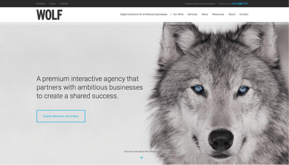
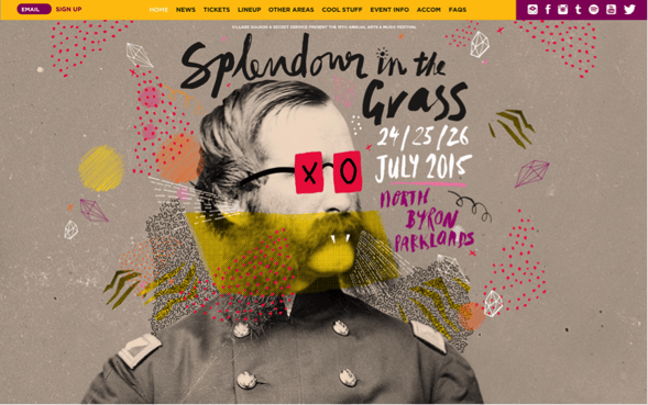
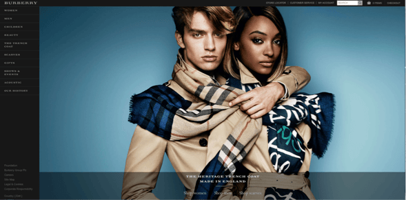

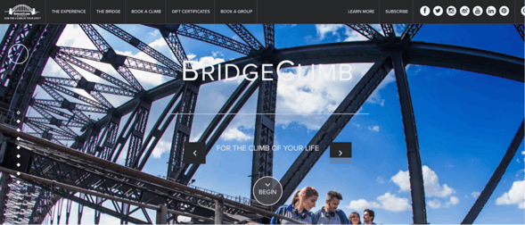
Hot tip: Make sure that the image is high resolution and also check when you optimize the page that the picture is shrinkable and doesn’t look ridiculous when your visitors are looking at the page on their mobile phone.
2. TOO much design
Coco Chanel famously said, “Before leaving the house, a lady should look in the mirror and remove one accessory”. She was a wise lady and we should listen to her, especially as this completely applies to website design. No matter how important the copy on your page may be, having an overly cluttered screen stuffed full of words and images can be confusing and confronting for a visitor.
A way to break down information in an aesthetically pleasing way is to design your website pages in sections or slices to make them easily digestible, and more importantly, optional for visitors to consume. This is particulary effective for your ‘Home’ page and ‘About Us / What we do’ page.
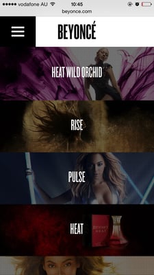
Here is how we did this on our own site, as well as a few faves of ours from the wider web:
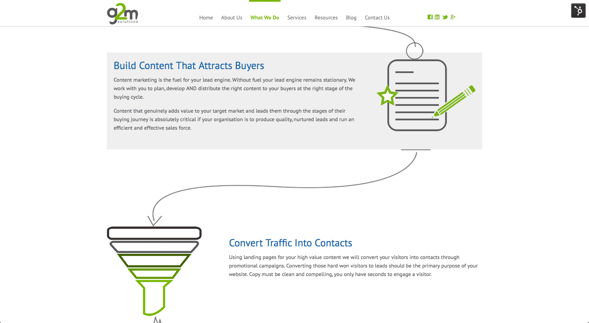
Something important to note: Though we are recommending that you cut down content from your home page, you shouldn’t lose that copy completely! Simply offer a ‘Read More’ button before the little snippet of information so that if a visitor wants to investigate further, they can, whilst still avoiding having to navigate through a busy page.
Hot tip: You can easily define your page breaks by colour blocking sections – just make sure you stick to neutrals or washed out versions of your own business colours.
3. Not optimising
This is a cardinal sin in the digital world. The stats have spoken – 46% of mobile owners use their mobile exclusively as a primary research tool – meaning that if you want to get those mobile visitors heading down an inbound tunnel then your website needs to look incredible and function perfectly on a shrunken screen.
Google has helpfully provided an easy way to check whether your site is mobile friendly just by popping in your URL. Click here to check whether your site ticks off that box now.
As a platinum partner of Hubspot, we optimise our clients’ websites to be mobile friendly, making sure that every page looks great and every link works.
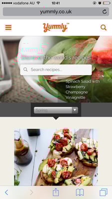
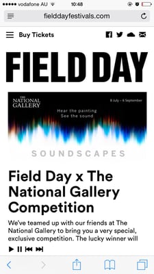
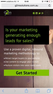
Here are a few of our favourite optimised websites, taken straight from a mobile device:
Bonus: If you have optimised your website for mobile then you will be in Google’s good books, because you will be complying with their new algorithm changes.
So now you have some inspiration for your website and a anti-to-do-list where you know the top 3 things to avoid, you can start jazzing up your site and delighting those visitors!
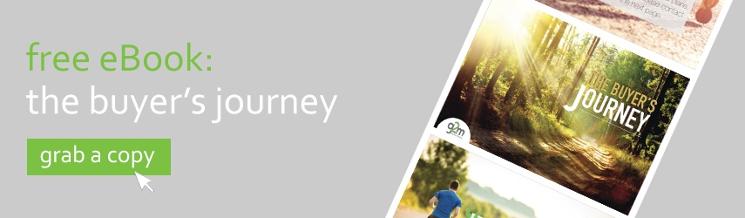
Though looking great is super useful for those essential first impressions, we all know that top quality content is what keeps visitors coming back for more. So, take the next step into becoming a vistor hot-spot by reading this free eBook on how to keep up with the content marketing revolution that is happening right now!

Everyone’s wittering on about AI like it’s the second coming. But here’s the rub: if you give it half-baked prompts, you’ll get half-baked answers....

The business world is falling head over heels for AI—and who can blame it? With promises to reduce grunt work, uncover insights, and turbocharge...

Search is evolving - fast. For two decades, SEO has revolved around Google’s algorithm: keywords, backlinks, metadata, and page speed. But with the...