BECOME W.I.S.E.R. with Your AI Prompts - A guide for sales managers
Everyone’s wittering on about AI like it’s the second coming. But here’s the rub: if you give it half-baked prompts, you’ll get half-baked answers....
4 min read
 Chris Fell
Updated on February 16, 2017


In this blog we have a look at 7 crucial features you need to use on your website to generate leads.These features can be broadly divided into things the visitor can and can’t see.
The fold describes the line that separates the bottom of the visible web page from the rest of the page that cannot be seen without scrolling. It helps if you imagine the web page as a single sheet of paper with a horizontal fold in it, everything below the fold cannot be seen and everything above can.

We recommend installing a tool such as Hotjar on your key pages to determine where your visitors are clicking and scrolling on a page. Importantly, you also need to understand the device on which your visitors are accessing your site. Is it a desktop or a mobile? With responsive design - a feature of almost all good websites these days - where the "the fold" is will change depending on the viewing device.
Regardless of this, a good lead-generating website ensures that the most important elements of the site are above the fold, or lets say are at least in the top third of the page. Everything in that first third should be tailored to your buyer and optimised to make it easy for them to find what they want. Critically examine the design of each of your pages with this in mind. Endless scrolling web pages (called parallax design) are popular at the moment and there isn't any strong evidence to say people don't like to scroll, but it is still wise to use the space above the fold as effectively as possible.
Calls-To-Action (CTAs) come in many forms, and any business serious about online lead generation need CTAs. These clickable buttons and images are the bridge that leads to the next step in your buyers' journey. In the case of digital marketing, this is downloadable content. If no one clicks on your CTAs, no one will visit your landing pages or fill out any forms and you will not generate any leads.
Your CTAs need to be clean and concise and use "action" words and phrases to encourage clicks. It should let the visitor know exactly where they are going when they click. This is usually done by giving a thumbnail image of the downloadable content that will appear on the landing page or using similar font, wording and imagery on both CTA and landing page, thus keeping a mental link for the visitor and reassuring them they have followed the right path.
A/B testing different variations of CTAs is a smart move. Just be careful to only change one element at a time or you won't understand what attribute caused the change in click through percentage. Was it the new image or the new button colour that caused the increase in click-throughs? Change both at the same time and you won't know.
Once your visitors have decided they want your down loadable content and have clicked one of your CTAs you need a page where they can quickly review what the content will deliver, easily fill out their details and download the content. Landing pages are much better when they are simple. You do not want to overwhelm the visitor; you want to briefly let them know what they are downloading and most importantly, how it will help them. You should aim to get the down loadable content’s value across with a few simple bullet points.
Below is an image of an extremely simple but effective landing page from Wistia (a video hosting service). It offers 4 concise bullet points and one field to fill out. The page is so simple and makes it seem so easy for the visitor to take the next step. Most experts advocate having minimal or zero navigation on the landing page to avoid distraction though in this case Wistia has offered some navigation for those who want more information and are still unsure.

This is a crucial element of any modern successful lead generating website. Many studies have shown that buyers are most influenced by colleagues, friends and family. Social sharing taps into this in a simple yet incredibly effective way. If my family or friends tell me to look at a McDonald's promotion or buy a Big Mac I am more likely to do it than if Ronald McDonald or the Hamburglar implored me to! Social sharing taps into a buyer’s strongest influencer network. The work you do on every other feature mentioned in this blog will be multiplied every time your site or content is shared socially or recommended to someone else.
The key with social sharing is to think carefully at all times about what is going to genuinely aid, assist, educate and inform your network. People have finely tuned bullshit detectors and will pick up a thinly disguised sales pitch from a mile away.
Simplicity is also key, so it is important that you do not overload your visitors with sharing options like the image below. Keep to the top three or four channels used by your target audience.

The metaphor of your webpage being a shopfront is commonplace in digital marketing, but your website can be so much more than just a shopfront. Given the right tools it can automatically sift through visitors and find the right ones for you to target, present different content to them and send out emails to encourage them along their buyer’s journey.

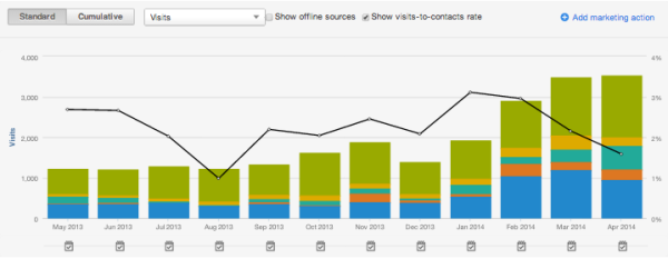
Analytics give you the ability to see what works and what doesn’t, to test and improve. With a solid analytics system attached to your website you can optimise and test all your online marketing channels and strategies, be they organic search, email marketing, social media or paid search. The insights you gain from the data on your buyer’s website experience will give you evidence of their interests, allowing you to create an even better offering.
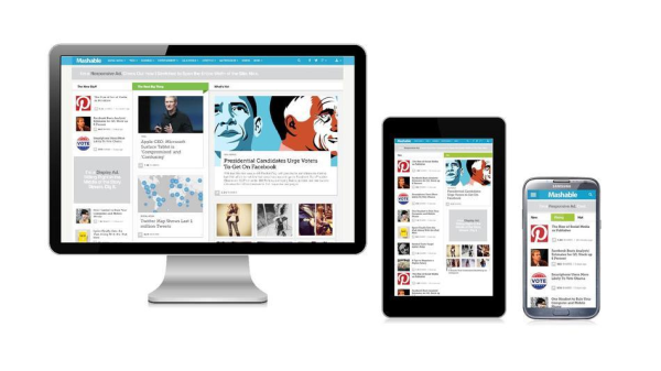
With the dramatic increase in mobile traffic, sites need to be responsive to visitors coming from a vast array of devices. Your website needs to be able to generate leads from a desktop computer, a tablet and a mobile phone equally well.

Your website must be built on a CMS platform that is responsive. End of story. Each page must automatically adapt its design for different screen sizes. Luckily, software such from the various marketing automation platforms, such as Hubspot, make it pretty easy to manage. Ignoring responsive design will significantly blunt your business' competitive edge not least because Google is actively penalising a site's ability to rank for keywords if it isn't responsive.
The final feature to consider for your website is something that many businesses leave to their developers. But it is something that each business should consider and work on during the website development phase. Work out the key pages of your site, how they interact and how you can make that interaction as easy as possible. From the home page how many clicks should your buyers make to get to where you want them to be?

Most importantly, always consider how your visitors will use the site. Think about how they will find their way around the site. It should be easy for the buyer to navigate your site and easy for them to find the information they need. They may not see your sitemap, but they will feel its effect and a well-thought out sitemap will translate into a pleasant experience for your buyer.
These are just some of the steps you need to create a strong lead generating website. If you would like to learn more about web design and optimisation tactics, please download our free eBook by clicking on the link below.
Subscribe to our latest news and updates on HubSpot.

Everyone’s wittering on about AI like it’s the second coming. But here’s the rub: if you give it half-baked prompts, you’ll get half-baked answers....

The business world is falling head over heels for AI—and who can blame it? With promises to reduce grunt work, uncover insights, and turbocharge...

Search is evolving - fast. For two decades, SEO has revolved around Google’s algorithm: keywords, backlinks, metadata, and page speed. But with the...