SME’s in Australia use email marketing as one of the key sales and marketing tactics to generate interest and brand awareness about their products and services. Today email marketing is a popular business tool that if used correctly can have a positive effect on a company’s bottom line to generate leads. This week we discuss the importance of responsive e-mail marketing.

Research
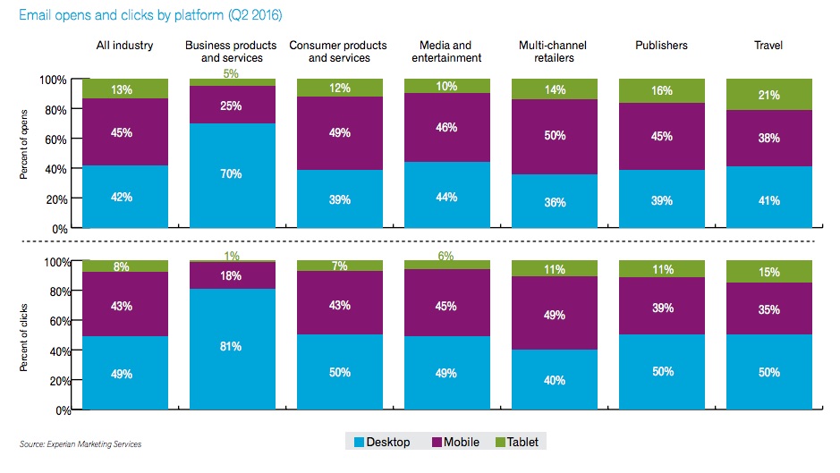
Research recently released by Experian has revealed that most emails sent by companies in the second quarter of 2016 (2Q16) were opened on mobile devices. Experian’s report was based on data from the company's clients. It found 58% of all email opens that were examined - occurred on mobile phones or tablets (45% phones, 13% tablets).
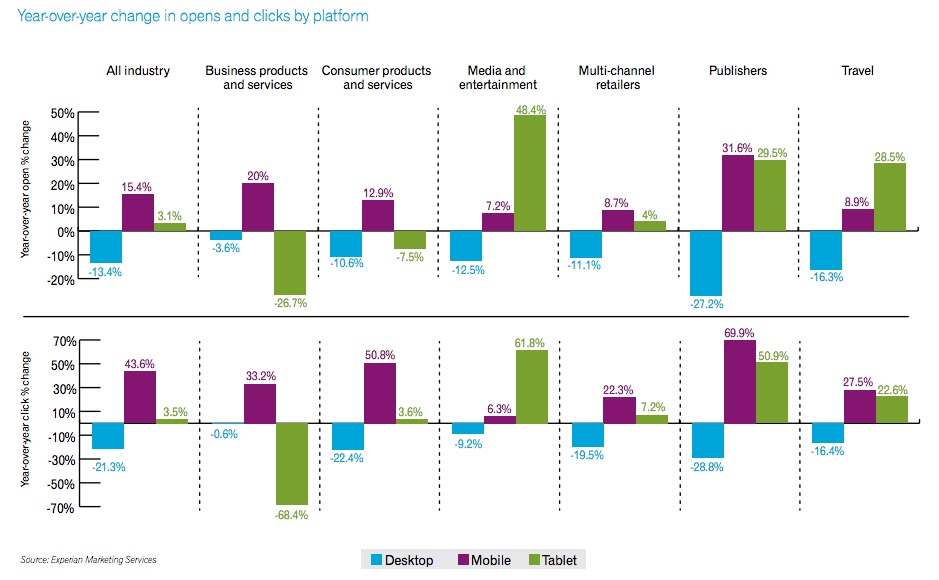
There was a 14% increase when compared to the 2015 research. The study also found that desktop computers accounted for only 42% of email opens, and were responsible for 49% of email-generated revenue. The industries examined by Experian in the study revealed year-over-year increases in email open and clicks on mobile phones from 2Q15 to 2Q16.
Today more than ever businesses need to ensure that their email marketing is responsive and has been correctly tested on all mobile devices and platforms. While emails can look great in your inbox, when they are viewed on the smaller screen, fonts and images can appear distorted and too small. If the email has not been correctly set up in the backend, the design and layout can break and become distorted and hard to read.
The below charts from Experian Marketing Services show email open clicks by platform and the year on year change


Listed below are tips to design and build mobile-friendly emails
1. Ensure designs are responsive
This means the email design, layout and images need to be adaptive and readable on smaller screens of mobile devices. The email needs to be built so it is responsive to any mobile device- including tablets, iPhone and Androids.
2. Use HTML attributes
For email design, it is advisable to use HTML attributes instead of CSS, as HTML is more reliable. Do note that CSS styles can be used in conjunction with HTML.
3. Use unique media queries and styles
When targeting tablets, larger-screen Android devices and other screen resolutions, you need both unique media queries and unique styles to match so that your email is readable on all mobile devices.
4. Ensure all images are optimised for mobile
As mobile devices can come in all shapes and sizes, it's important to make fluid email layouts and ensure that images are responsive so they can be viewed in the right size on different mobile devices.
5. Make sure you optimise your subscriber forms for mobile
To optimise your email forms make sure there are not too many fields and that they require less effort and time to complete on a mobile device and you will gain better completion rates for forms.
Now more than ever it's important for marketers to understand how an email design, image and layout will render on a mobile device. As research shows this is where most e-mails are opened. E-mails that do not render properly look unprofessional and could prevent you converting leads.


